WoodmenLife Tower
Moderators: Coyote, nebugeater, Brad, Omaha Cowboy, BRoss
Re: Woodmen Tower
Downtown Omaha is looking pretty at night from the Falcon Cam on the Woodman Tower. Check it out tonight https://falcons.woodmenlife.org/falcon-cam.cfm
"Prediction is very difficult, especially about the future." -- Niels Bohr
-
Coyote

- City Council
- Posts: 33272
- Joined: Tue Nov 18, 2003 11:18 am
- Location: Aksarben Village
- Contact:
Re: Woodmen Tower
Happy 50th, Woodmen Tower! Here's four things you should know about the iconic Omaha building
[youtube][/youtube]
Peter Kiewit Sons’ Inc. broke ground on May 23, 1966. The building opened on April 4, 1969, and was officially dedicated June 6.
[youtube][/youtube]
-
RockHarbor
- Planning Board
- Posts: 2093
- Joined: Wed Mar 23, 2005 7:42 am
- Location: Silver State
Re: Woodmen Tower
Happy Birthday to the good ole' Woodmen Tower!Coyote wrote: ↑Sat Jun 08, 2019 8:58 am Happy 50th, Woodmen Tower! Here's four things you should know about the iconic Omaha building
Peter Kiewit Sons’ Inc. broke ground on May 23, 1966. The building opened on April 4, 1969, and was officially dedicated June 6.
[youtube][/youtube]
Since I want those letters replaced at the top with the company's new (and very likable) logo, funny, I was just thinking about how they've been up there almost "half a Century." That's a looooong time for a logo at the top of a building. Then, the Woodmen's 50th B-day comes days later...
I can get pushed out because I'm "too much" for some. Then, an observer of me comes suddenly swooping in to "fill my shoes." People are always more accepting of the new one, because their feathers aren't truly ruffled by them. (Yawn) I can count on it every time.
Re: Woodmen Tower
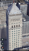
I don’t mind the Woodmen letters. I can’t think of another city that has had the same name and same letter style on the top of one their tallest buildings for as long as Omaha’s Woodmen. Maybe some east coast cities have us beat. What is also interesting is outside of Omaha most people have never heard of Woodmen. I suppose something else besides WOODMEN letters could look cooler and more up to date. I did find this building in Philadelphia looks like they could have Woodmen beat. And Foshay in Minneapolis is another. But neither of these buildings are anywhere near being the tallest in their cities anymore. While Woodmen is still dominant in Omaha as we really have only two skyscrapers.


Re: Woodmen Tower
And another...
He said "They are some big, ugly red brick buildings"
...and then they were gone.
...and then they were gone.
-
RockHarbor
- Planning Board
- Posts: 2093
- Joined: Wed Mar 23, 2005 7:42 am
- Location: Silver State
Re: Woodmen Tower
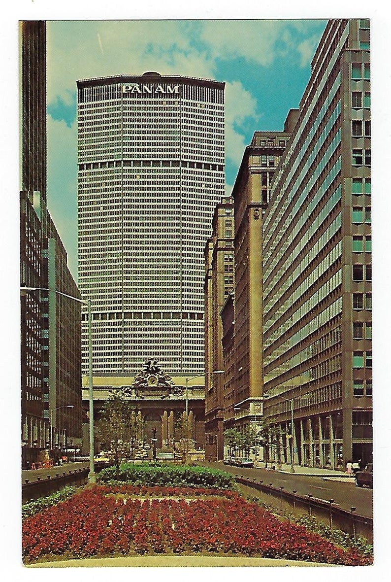
Funny, I also thought of the PAN AM building in NYC, when I pointed out how unusually long Woodmen's logo has not changed -- and how that is not typical for any company at all. That's the only example that came to mind. However, your other two examples I didnt think of.
That "Pan Am" logo/font matches the 60's architecture of the building well, so it just works. I was also unsure whether Pan Am was now out of business, as I thought they were, and if they are, I thought maybe those letters were simply left because the "Pan Am" name of the building, and that lettering at the top of the broad, octagonal building, has long been an established landmark in New York -- the building standing tall as a visual centerpiece at the end of a long, main city boulevard, an obvious break in Manhattan's nearly perfect grid. I didnt have time to research it. So, I wasnt sure if it was a fair "apples to apples" comparison to the Woodmen Tower's situation.
Isnt "Foshay" indented into the stone of the art deco building? It looks charming, historic, and stylish. And, that Philadelphia building's PSFS logo is kept around because, I think, it always had a very nice and basic, stylish, fashionable, cosmo retro font -- enough so, that it lasted through all the decades. Nowadays, those letters definitely look "cool" again. And, that roof-top sign is part of the architecture of the building. Its an architectural feature. Its more than just a logo.
Woodmen's letters arent really stylish. They are more "very basic." We are so used to them, and they've worked for the tower so long, and they match the striped tower well enough, that I dont think they look terrible, or anything -- as I've never thought they looked terrible. However, they aren't stylish & special enough that it is a "must" to retain them, nor keep them around as they match the architecture & character of the building in a way that it would be a "disappointing loss" to let them go. Im just tired of them, looking at them for my entire life -- almost like an old bedspread Ive had for a decade that I cant stand to look at one more day.
Whatever. Im not sure I really care that much. If Woodmen wants the same ole look, if Omaha wants major logos on major buildings that date way back to 1975, then let the Woodmen, let Omaha. Its their choice. I just feel like Woodmen Life's new logo at the top of the tower will give a needed "freshening up" that will be nice with the brand new look of the park -- yet another step in making sure to bring Omaha fully up-to-date, making sure its moving forward.
Yes, Woodmen Insurance isnt known that well outside Omaha, yet I dont think Principal Insurance is known that well outside of Des Moines either.
I can get pushed out because I'm "too much" for some. Then, an observer of me comes suddenly swooping in to "fill my shoes." People are always more accepting of the new one, because their feathers aren't truly ruffled by them. (Yawn) I can count on it every time.
Re: Woodmen Tower
Yes maybe Foshay letters are part of the building and can’t be removed, that would explain why they haven’t changed. Principal is a much larger company than Woodmen. I just saw a Principal commercial on TV recently. They used to be called Bankers life but changed their name about 30 years ago. But I agree for a big insurance company they don’t have the best name recognition. Mutual of Omaha’s is better, even though MOA is a smaller company than Principal . I just don’t think those WOODMEN letters will get removed anytime soon. I get the impression that Woodmen doesn’t like change or care about being trendy or up to date. And that’s their choice, they are an outstanding local corporate citizen and the building appears to be in excellent condition, except for some replacement windows that don’t match which you mentioned on a earlier post. The tower just celebrated its 50th anniversary, now would of been the perfect time to remove the woodmen letters and replace with their new better looking logo, but they didn’t. I just found this on internet, Principal does have their name on a building but not in Des Moines. My guess is this building is somewhere in Asia.

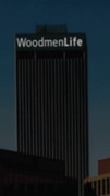
Woodmen sign for reference.
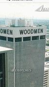
Woodmen sign for reference.
Re: Woodmen Tower
The PAN AM building became the MetLife building...

https://en.wikipedia.org/wiki/MetLife_Building
The most interesting and controversial thing about PAN AM building is that it was built looming over Grand Central Terminal. I'm so glad they didn't tear down GCT, since it's one of my favorite places in NYC.
https://en.wikipedia.org/wiki/MetLife_Building
The most interesting and controversial thing about PAN AM building is that it was built looming over Grand Central Terminal. I'm so glad they didn't tear down GCT, since it's one of my favorite places in NYC.
He said "They are some big, ugly red brick buildings"
...and then they were gone.
...and then they were gone.
-
RockHarbor
- Planning Board
- Posts: 2093
- Joined: Wed Mar 23, 2005 7:42 am
- Location: Silver State
Re: Woodmen Tower
I didnt know that Principal Insurance in Des Moines used to be "Banker's Life." I almost think that name is more famous than "Principal Insurance", but I like the name "Principal Insurance" a lot better. I like "Woodmen Life Insurance", too -- just like I like "Woodfield Mall" in the Chicago area. It just sounds nice.
I totally forgot they replaced "Pan Am" with "MetLife." Yes, I have seen that before now that you remind me, but I long forgot about it. I always still think "Pan Am" with that New York building -- and I was sure Pan Am was no longer in business, so I was bewildered. Notice the new "MetLife" logo works well w/ that 60's skyscraper, too?
Whatever Woodmen does, Woodmen does. I agree they seem like the insurance office that still has 70's carpet, pictures, and furniture -- because being a "penny pinchers" is not unwise. (I knew an Asian guy once, kinda a friend, and he told me that Asians typically never remodel, and that's part of their financially smart reputation.) I get it. Still, I also think "How do you stand it in here everyday?" when sitting in one of those old, dated insurance offices -- decor that should have probably been thrown out with the 70'd plaid tie & suit. I dont think it looks good. Even churches remodel...
I can get pushed out because I'm "too much" for some. Then, an observer of me comes suddenly swooping in to "fill my shoes." People are always more accepting of the new one, because their feathers aren't truly ruffled by them. (Yawn) I can count on it every time.
-
obvious2677
- Library Board
- Posts: 283
- Joined: Thu Mar 22, 2018 7:43 pm
Re: Woodmen Tower
Most interesting? Eli Black (CEO of United Brands - now Chiquita) used his briefcase to shatter a window on the 44th floor and jumped, after the SEC found out he paid bribes for bananas.GetUrban wrote: ↑Thu Jun 13, 2019 10:28 am The PAN AM building became the MetLife building...
https://en.wikipedia.org/wiki/MetLife_Building
The most interesting and controversial thing about PAN AM building is that it was built looming over Grand Central Terminal. I'm so glad they didn't tear down GCT, since it's one of my favorite places in NYC.
-
Wrightfan
- New to the Neighborhood
- Posts: 37
- Joined: Sat Apr 30, 2016 12:30 pm
- Location: Chicago north side
Re: Woodmen Tower
Actually, it is Principal Financial Group. Their commercials play in Chicago. (and I consult in the insurance industry)RockHarbor wrote: ↑Thu Jun 13, 2019 12:13 pm I didnt know that Principal Insurance in Des Moines used to be "Banker's Life." I almost think that name is more famous than "Principal Insurance", but I like the name "Principal Insurance" a lot better.
-
RockHarbor
- Planning Board
- Posts: 2093
- Joined: Wed Mar 23, 2005 7:42 am
- Location: Silver State
Re: Woodmen Tower
Oh, that's right. "PRINCIPAL FINANCIAL GROUP." I do love the ring of that. Thanks for the correction. It almost reminds me of "THE HARTFORD GROUP." It sounds so intimidating to me...Wrightfan wrote: ↑Thu Jun 13, 2019 6:31 pmActually, it is Principal Financial Group. Their commercials play in Chicago. (and I consult in the insurance industry)RockHarbor wrote: ↑Thu Jun 13, 2019 12:13 pm I didnt know that Principal Insurance in Des Moines used to be "Banker's Life." I almost think that name is more famous than "Principal Insurance", but I like the name "Principal Insurance" a lot better.
I can get pushed out because I'm "too much" for some. Then, an observer of me comes suddenly swooping in to "fill my shoes." People are always more accepting of the new one, because their feathers aren't truly ruffled by them. (Yawn) I can count on it every time.
Re: Woodmen Tower
Woodmen Tower's signage has been the same for 51 years.....That changes this summer! Soon to be WoodmenLife Tower!
https://newsroom.woodmenlife.org/woodme ... the-tower/
https://newsroom.woodmenlife.org/woodme ... the-tower/
-
skinzfan23

- City Council
- Posts: 9252
- Joined: Mon Feb 09, 2004 11:26 am
- Location: Omaha/Bellevue
Re: Woodmen Tower
Thanks for posting:
Details of the new lettering:
Details of the new lettering:
This multimillion dollar project started June 8 and will take place in stages, as Omaha Neon Sign Co. Inc. removes existing lettering in pieces, cleans and patches the marble, and installs new brackets, electrical wiring and the letters. The metal letters — which will appear black during the day and white at night — will be smaller to make room for more of them, but they’ll also be visible from farther away, thanks to the new LED system that shines light through tiny holes in the film on the letters. An electrical grid is being installed to light all four sides, which will enhance the tower lightings WoodmenLife is known for.
Re: Woodmen Tower
Looking forward to it, I like that it lights up at night. Hopefully it looks good and not cheap.
-
Omaha Cowboy

- The Don
- Posts: 1013188
- Joined: Wed Jan 07, 2004 5:31 am
- Location: West Omaha
Re: Woodmen Tower
I’m actually kind of excited to see this new look..
The lighting of the lettering could look really cool if it’s done right...
Ciao..LiO...Peace
The lighting of the lettering could look really cool if it’s done right...
Ciao..LiO...Peace
Go Cowboys!
Re: Woodmen Tower
Good way to upgrade a substantial tower.
Re: Woodmen Tower
Agreed, especially if they include the logo.Omaha Cowboy wrote: ↑Wed Jun 10, 2020 7:28 am I’m actually kind of excited to see this new look..
The lighting of the lettering could look really cool if it’s done right...
Ciao..LiO...Peace
-
Omaha Cowboy
- The Don
- Posts: 1013188
- Joined: Wed Jan 07, 2004 5:31 am
- Location: West Omaha
Re: Woodmen Tower
Yes! That would be a nice touch...omahahawk wrote: ↑Wed Jun 10, 2020 5:33 pmAgreed, especially if they include the logo.Omaha Cowboy wrote: ↑Wed Jun 10, 2020 7:28 am I’m actually kind of excited to see this new look..
The lighting of the lettering could look really cool if it’s done right...
Ciao..LiO...Peace
Ciao..LiO...Peace
Go Cowboys!
-
skinzfan23
- City Council
- Posts: 9252
- Joined: Mon Feb 09, 2004 11:26 am
- Location: Omaha/Bellevue
Re: Woodmen Tower
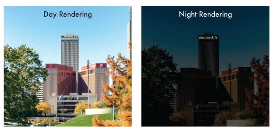
Here are the renderings:
Re: Woodmen Tower
With the change of the signage, will you all be calling it the "Woodmen" still, or should we call it the "WoodmenLife Building"?
-
skinzfan23
- City Council
- Posts: 9252
- Joined: Mon Feb 09, 2004 11:26 am
- Location: Omaha/Bellevue
Re: Woodmen Tower
Pretty sure most people will still call it Woodmen. Just like a lot of people call the arena Qwest Center of CenturyLink Center.
-
Omaha Cowboy
- The Don
- Posts: 1013188
- Joined: Wed Jan 07, 2004 5:31 am
- Location: West Omaha
Re: Woodmen Tower
I’ll say I’d refer to it as either. But since the signage will be new, I’ll get used to calling it the “WoodmanLife” building..for accuracy purposes at least, lol..
And it looks like no company logo, just the lighted lettering. I still think it’ll look sharp and stand out more once completed...
Ciao..LiO...Peace
Go Cowboys!
Re: Woodmen Tower
I still call the CHI Health Center Centurylink (I moved here in 2012), so it will take me a while to transition.Omaha Cowboy wrote: ↑Thu Jun 11, 2020 9:37 amI’ll say I’d refer to it as either. But since the signage will be new, I’ll get used to calling it the “WoodmanLife” building..for accuracy purposes at least, lol..
Re: Woodmen Tower
It's tough when it changes every 8-10 years ha. I still call it the Clink as well.ita wrote: ↑Thu Jun 11, 2020 11:15 amI still call the CHI Health Center Centurylink (I moved here in 2012), so it will take me a while to transition.Omaha Cowboy wrote: ↑Thu Jun 11, 2020 9:37 amI’ll say I’d refer to it as either. But since the signage will be new, I’ll get used to calling it the “WoodmanLife” building..for accuracy purposes at least, lol..
-
Omaha Cowboy
- The Don
- Posts: 1013188
- Joined: Wed Jan 07, 2004 5:31 am
- Location: West Omaha
Re: Woodmen Tower
Right! CHI Health Center still does not sound natural, lol...Louie wrote: ↑Thu Jun 11, 2020 11:39 amIt's tough when it changes every 8-10 years ha. I still call it the Clink as well.ita wrote: ↑Thu Jun 11, 2020 11:15 amI still call the CHI Health Center Centurylink (I moved here in 2012), so it will take me a while to transition.Omaha Cowboy wrote: ↑Thu Jun 11, 2020 9:37 amI’ll say I’d refer to it as either. But since the signage will be new, I’ll get used to calling it the “WoodmanLife” building..for accuracy purposes at least, lol..
Ciao..LiO...Peace
Go Cowboys!
Re: WoodmenLife Tower
This will be a welcome change. In some ways I wish they wouldn’t light up the Woodmen Tower anymore once this is complete. I like the way the building looks unlighted with just the sign Lights on.
-
Omaha Cowboy
- The Don
- Posts: 1013188
- Joined: Wed Jan 07, 2004 5:31 am
- Location: West Omaha
Re: WoodmenLife Tower
From the W-H-
“This multimillion-dollar project started Monday and will take place in stages, WoodmenLife said. Omaha Neon Sign Co. workers will remove existing lettering in pieces, clean and patch the marble and install new brackets, electrical wiring and letters. The metal letters — which will appear black during the day and white at night — will be smaller to make room for more of them, but they also will be visible from farther away because of a new LED system that shines light through tiny holes in the film on the letters.”..
The complete story link:
https://www.omaha.com/news/local/name-a ... 3a3.html#1
Ciao..LiO...Peace
Go Cowboys!
-
SiliconFarmer
- New to the Neighborhood
- Posts: 46
- Joined: Wed Jul 25, 2018 2:30 pm
- Location: Downtown
Re: WoodmenLife Tower
The letters are being removed today!!
-
Busguy2010

- County Board
- Posts: 5342
- Joined: Sat Apr 09, 2011 7:32 pm
- Location: North Central Omaha
Re: WoodmenLife Tower
Someone take a picture of it bare
Re: WoodmenLife Tower

From WOWT city cams today. Hope those letter stains aren’t to stubborn to remove.
-
skinzfan23
- City Council
- Posts: 9252
- Joined: Mon Feb 09, 2004 11:26 am
- Location: Omaha/Bellevue
Re: WoodmenLife Tower
I saw on Facebook that Ric Flair was moving to town:

Re: WoodmenLife Tower
I'd be scared sh!tless if I was one of these guys! Drone footage of WOODMEN letters being removed:
-
Omahacritic
- Human Relations
- Posts: 833
- Joined: Thu Jul 18, 2019 11:10 pm
Re: WoodmenLife Tower
It’s bare if you all want to come see it.
The interesting part will be the view from Iowa at night once the new lettering is installed and lit.
The interesting part will be the view from Iowa at night once the new lettering is installed and lit.
Re: WoodmenLife Tower
I may be in the minority on this topic, but I like the Woodmen Tower better without letters or a sign. To me, it has a cleaner, more sophisticated look without a sign or logo.

Re: WoodmenLife Tower
I'll second that... always hated the signage.
Shoot for the Moon... if you miss, you'll land among the stars.
-
Omaha Cowboy
- The Don
- Posts: 1013188
- Joined: Wed Jan 07, 2004 5:31 am
- Location: West Omaha
Re: WoodmenLife Tower
I would have been fine with them simply replacing the old lettering with new WOODMAN lettering which lights at night...
Ciao..LiO...Peace
Ciao..LiO...Peace
Go Cowboys!
-
Omahacritic
- Human Relations
- Posts: 833
- Joined: Thu Jul 18, 2019 11:10 pm
Re: WoodmenLife Tower
You could say that about any signage on any building. Cliche time ... it is what it is.
However, what the sign does is give the Woodmen Tower a bit of iconic status over 1st Nat Tower. Sort of makes it stand taller... “I am Woodmen, hear me roar”.
Re: WoodmenLife Tower
The Woodmen looks good without letters. But it’s their choice if they want to add letters on the building. I believe it should still look good with the new signage but I was surprised how good it looks without any. It almost looks a little more sleek and sophisticated without letters.
Last edited by Cermak on Thu Jul 16, 2020 5:39 pm, edited 2 times in total.