WoodmenLife Tower
Moderators: Coyote, nebugeater, Brad, Omaha Cowboy, BRoss
-
PotatoeEatsFish

- Human Relations
- Posts: 750
- Joined: Wed Jul 22, 2015 11:59 pm
-
PotatoeEatsFish
- Human Relations
- Posts: 750
- Joined: Wed Jul 22, 2015 11:59 pm
Re: Woodmen Tower
Just a random question.
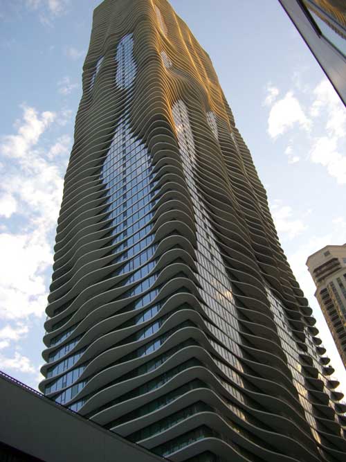
Could the outside of the Woodmen ever be updated to feature a wave affect like the Aqua Building in Chicago? They would just have to do some exterior changes to make the building look a whole lot better without demolishing it. Because I need to be brutally honest when I say this, the Woodmen is ugly.
Could the outside of the Woodmen ever be updated to feature a wave affect like the Aqua Building in Chicago? They would just have to do some exterior changes to make the building look a whole lot better without demolishing it. Because I need to be brutally honest when I say this, the Woodmen is ugly.
#SaveTheUglyGrainSilos2024
Re: Woodmen Tower
I know the Woodmen represents modern architecture, but I agree it is quite ugly. It would be nice if a building could be added to the skyline that reflects architecture that is consistent with trends from the last 15 years.
Re: Woodmen Tower
I don't see why not they've been retrofitting balconies to older buildings around downtown. I suppose in the Woodmen's case you'd only need some sort of awning system. You could probably get some sort of energy benefits from such a system maybe even subsidies to augment the cost.
15-17, 26, 32
-
Busguy2010

- County Board
- Posts: 5343
- Joined: Sat Apr 09, 2011 7:32 pm
- Location: North Central Omaha
Re: Woodmen Tower
The Woodmen is fine and I'm glad they made it interesting with the lighting. I personally feel that building pictured above is ugly. I tend to look at the Woodmen tower and see a reflection of the World Trade Center; also "ugly" buildings, but now iconic.
-
Seth

- Parks & Recreation
- Posts: 1437
- Joined: Mon Jan 11, 2010 4:59 pm
- Location: Ford Birthsite Neighborhood
Re: Woodmen Tower
I really hope no one tries to change it. The vast majority of efforts to "update" architecture just make it look worse, and destroy the time and style of the era reflected by the structure.
Do I need to mention all the turn-of-the-century downtown brick storefronts covered up with cheap facades in the 50s, 60s, and 70s?
Do I need to mention all the turn-of-the-century downtown brick storefronts covered up with cheap facades in the 50s, 60s, and 70s?
Re: Woodmen Tower
I think the Woodmen Tower is a great example of mid-century modernism. I remember when it was being built in '68 and the excitement it created downtown---it was our first real skyscraper. I like the sleek lines and the building materials used in the construction. I don't know what stone was used for the first 4 floors but it sorta' looks like white marble from a distance, even if it's not. Keep in mind that 50 years ago, Art Deco architecture was considered old and ugly.

Re: Woodmen Tower
The only thing I wouldn't mind them changing is if they took the black lettering off across the top and updated it with a logo or something not quite so garish.
When fortune smiles on something as violent and ugly as revenge, it seems proof like no other that not only does God exist, you're doing his will.
The Bride
The Bride
Re: Woodmen Tower
I agree. The lettering doesn't look good----it wasn't there in the beginning.
-
Athomsfere
- Planning Board
- Posts: 2068
- Joined: Mon Sep 14, 2015 10:03 pm
Re: Woodmen Tower
I tend to agree. The Woodman and this style are ugly, bland, boring and everywhere.Busguy2010 wrote:The Woodmen is fine and I'm glad they made it interesting with the lighting. I personally feel that building pictured above is ugly. I tend to look at the Woodmen tower and see a reflection of the World Trade Center; also "ugly" buildings, but now iconic.
But it is a good look at where we were in the 60's and compared to some of the googie / post modernism it could have had... Well it just shows you why updating it could be bad. Waveform might look great, or even OK today but sometimes these styles look terrible later.
-
OmahaOmaha
- Home Owners Association
- Posts: 215
- Joined: Wed Jul 30, 2014 5:30 pm
- Location: West Omaha
Re: Woodmen Tower
Probably about 20 years ago, the US West building in downtown Sioux Falls (now Century Link Tower) was refaced. It was a huge improvement and really modernized the building. I can't seem to find any pictures of the building with the original facade. Personally, I don't have a problem with the Woodman Tower. If they changed it to look like the Aqua building in Chicago, I think it would look terrible. You can get away with a design like that in Chicago, but it would look really out of place in Omaha.

Re: Woodmen Tower
I looked up Northwestern Bell building and Google image search came up with this:OmahaOmaha wrote:Probably about 20 years ago, the US West building in downtown Sioux Falls (now Century Link Tower) was refaced. It was a huge improvement and really modernized the building. I can't seem to find any pictures of the building with the original facade. Personally, I don't have a problem with the Woodman Tower. If they changed it to look like the Aqua building in Chicago, I think it would look terrible. You can get away with a design like that in Chicago, but it would look really out of place in Omaha.
http://siouxcityjournal.com/blogs/sioux ... a94f0.html
Verbum Domini Manet in Aeternum
-
OmahaOmaha
- Home Owners Association
- Posts: 215
- Joined: Wed Jul 30, 2014 5:30 pm
- Location: West Omaha
Re: Woodmen Tower
That's in Sioux City, not Sioux Falls. The Century Link tower is 11 stories tall.OmahaOmaha wrote:Probably about 20 years ago, the US West building in downtown Sioux Falls (now Century Link Tower) was refaced. It was a huge improvement and really modernized the building. I can't seem to find any pictures of the building with the original facade. Personally, I don't have a problem with the Woodman Tower. If they changed it to look like the Aqua building in Chicago, I think it would look terrible. You can get away with a design like that in Chicago, but it would look really out of place in Omaha.
-
OmahaOmaha
- Home Owners Association
- Posts: 215
- Joined: Wed Jul 30, 2014 5:30 pm
- Location: West Omaha
Re: Woodmen Tower
Here is what it looks like after the new facade was put on...
https://upload.wikimedia.org/wikipedia/ ... alls_3.jpg
https://upload.wikimedia.org/wikipedia/ ... alls_3.jpg
-
Athomsfere
- Planning Board
- Posts: 2068
- Joined: Mon Sep 14, 2015 10:03 pm
Re: Woodmen Tower
Ew!OmahaOmaha wrote:Here is what it looks like after the new facade was put on...
https://upload.wikimedia.org/wikipedia/ ... alls_3.jpg
I mean, neatish... but it looks, ew.

Re: Woodmen Tower
Changing the Woodmen would be awful.
-
OmahaOmaha
- Home Owners Association
- Posts: 215
- Joined: Wed Jul 30, 2014 5:30 pm
- Location: West Omaha
Re: Woodmen Tower
Keep in mind, the new facade was put on about 20 years ago. It was pretty modern at the time and a huge improvement over what the building looked like before. In fact, if I remember right, I think most of the windows on the new facade aren't even real. Originally, I don't believe there were many windows before. I wish I could find a photo of what it looked like before.Athomsfere wrote:Ew!OmahaOmaha wrote:Here is what it looks like after the new facade was put on...
https://upload.wikimedia.org/wikipedia/ ... alls_3.jpg
I mean, neatish... but it looks, ew.
Anyway, unless they find some structural problem with the Woodman's facade (which is the reason they changed the facade on the Sioux Falls building), I don't think they will ever change it. The cost wouldn't be feasible.
Re: Woodmen Tower
If they change it, and I don't think it ever will be changed, it would render the new lighting scheme useless. Honestly I think the lighting system is the best part of it now.
When fortune smiles on something as violent and ugly as revenge, it seems proof like no other that not only does God exist, you're doing his will.
The Bride
The Bride

Re: Woodmen Tower
The Woodmen Tower (which is apparently now the WoodmenLife Tower) is a strong expression of the international style. And, while it may not be the favorite of a lot of people, shouldn't be changed much. It's fairly architecturally significant.
OMA-->CHI-->NYC
-
Athomsfere
- Planning Board
- Posts: 2068
- Joined: Mon Sep 14, 2015 10:03 pm
Re: Woodmen Tower
Which re-affirms my earlier statement. Modernizing these buildings usually turns out even worse later when that fad ends. ;)OmahaOmaha wrote: Keep in mind, the new facade was put on about 20 years ago. It was pretty modern at the time and a huge improvement over what the building looked like before. In fact, if I remember right, I think most of the windows on the new facade aren't even real. Originally, I don't believe there were many windows before. I wish I could find a photo of what it looked like before.
Anyway, unless they find some structural problem with the Woodman's facade (which is the reason they changed the facade on the Sioux Falls building), I don't think they will ever change it. The cost wouldn't be feasible.
-
RockHarbor

- Planning Board
- Posts: 2093
- Joined: Wed Mar 23, 2005 7:42 am
- Location: Silver State
Re: Woodmen Tower
Neat seeing the construction photo with the worker sitting there. I also hate seeing that historic WotW building go down. That was such a beauty. I would love seeing that still standing downtown today.
There's something about the Woodmen Tower that is surprisingly, regionally iconic for such a simple, boxy skyscraper. Sure, it was Omaha's tallest for three decades or more, but Des Moines has a black boxy skyscraper that stood as the tallest from 1974 to 1990, a shorter time period, and it never was really "iconic" like the Woodmen. I wonder why? Maybe it is the white top, the horizontal ribbons of thick, dark windows at the top and bottom, mixed with the verticle momentum caused by the thin stripes? It is pleasing. Maybe it is the lettering?
The Lettering: Although I'm so used to the lettering at the top, and it is just part of Omaha, and I like seeing "Woodmen" up there, I sometimes like seeing the letters not there in the earliest pictures of the newly completed tower -- or even when they Photoshop-out it out when they use the Omaha skyline in an advertisement (along with other logos, to not give company's free advertisement). Sometimes I wish Woodmen would just use their circular logo on all four sides (like put in the corner on all 4 sides), rather than those big, non-glowing letters. I just don't see that type of non-glowing signage on buildings that often.
I don't know. What do you think?
I can get pushed out because I'm "too much" for some. Then, an observer of me comes suddenly swooping in to "fill my shoes." People are always more accepting of the new one, because their feathers aren't truly ruffled by them. (Yawn) I can count on it every time.
-
Athomsfere
- Planning Board
- Posts: 2068
- Joined: Mon Sep 14, 2015 10:03 pm
Re: Woodmen Tower
As far as the international style goes, I like the Woodman. Even the giant "Woodmen". It sort of feels like stoic, like "Yeah, I'm the Woodmen from the 70's. What of it?"
For example the BOK Tower seems less strong. Same style building, but it looks worse to me. More run down, proportions a little too far off "right".
For example the BOK Tower seems less strong. Same style building, but it looks worse to me. More run down, proportions a little too far off "right".
-
Joe_Sovereign
- Library Board
- Posts: 433
- Joined: Thu Sep 06, 2012 3:57 pm
- Location: Omaha Metro Area
Re: Woodmen Tower
[Sarcasm] Yes we should definitely tear down buildings when their style of architecture hits its cyclic low point in popularity. If we don't then what "lost architectural treasures" will people cry about in 30 years. [/Sarcasm]
-
yard salad
- Home Owners Association
- Posts: 61
- Joined: Wed Nov 11, 2015 10:01 am
- Location: midtown
Re: Woodmen Tower
A good reminder that the Queen Anne and Neo-Victorian styles went through a low point in popularity too. People hated buildings in that style and the Arts and Crafts movement was somewhat a backlash against this.Joe_Sovereign wrote:[Sarcasm] Yes we should definitely tear down buildings when their style of architecture hits its cyclic low point in popularity. If we don't then what "lost architectural treasures" will people cry about in 30 years. [/Sarcasm]
-
RockHarbor
- Planning Board
- Posts: 2093
- Joined: Wed Mar 23, 2005 7:42 am
- Location: Silver State
Re: Woodmen Tower
I get what I mean. Good point! You could almost say you feel it has a "living personality", or something. That's not uncommon with beloved buildings. (In Chicago, they call the John Hancock Center "Big John", and it almost has that living personality to it, imo.) Yes, that is part of the "iconic" aspect of the tower, I think.Athomsfere wrote:As far as the international style goes, I like the Woodman. Even the giant "Woodmen". It sort of feels like stoic, like "Yeah, I'm the Woodmen from the 70's. What of it?"
For example the BOK Tower seems less strong. Same style building, but it looks worse to me. More run down, proportions a little too far off "right".
Yes, I think the Woodmen is a wonderful example of the boxy International Style, popular in the 60's and 70's -- although not the purest, perfect example out there, imo. It still looks very nice in today's time.
My favorite more modern boxy building is Denver's Republic Plaza. SOM put up several white boxes in that time period (Houston, Chicago, New Orleans, and Denver), but Denver's is the one I feel is perfect. I've never seen a building celebrate the simplicity & beauty of the basic square & rectangle so satisfyingly well. In a Denver architecture guide, they call the building a "triumph" in design, and I agree.
The "BOK Tower": Do you mean the former tallest in Oklahoma City? I'm assuming that's what you mean. I do like the rectangular block shape, and vertical lines -- but, I wouldn't say it is as "easy to love" as the Woodmen. I agree. I've actually been to the top of it, and looked out, and taken pictures -- allowed due to a gracious worker at the top. It was neat to look out and see the city. Unlike Dallas, It's a town that I don't quite fully understand the "heartbeat" of it (yet), and it intrigues me in a way.
I also like the thicker black & thinner white striped boxes of the 1970's (Omaha has one -- the 1972 First National Bank), and Indianapolis had a wonderful example of that era seen in the FIRST INDIANA BANK downtown. To me, it was a PERFECT example of that type of architecture of the 70's. But, then...rough weather knocked out parts of the facade, and it set off a series of remodels, so that look is now lost. Although I feel the latest remodel (involving silver glass and horizontal lines) really isn't bad, it doesn't match the original 70's-style pillars around the base. I don't like the skyline as well without that original facade on that bank. So it goes to show: Everything doesn't have to be always "brought up to date." And: Sometimes it is just best to leave things alone.
Last edited by RockHarbor on Fri Apr 08, 2016 2:04 pm, edited 3 times in total.
I can get pushed out because I'm "too much" for some. Then, an observer of me comes suddenly swooping in to "fill my shoes." People are always more accepting of the new one, because their feathers aren't truly ruffled by them. (Yawn) I can count on it every time.

Re: Woodmen Tower
The Woodmen isn't the most exciting building design-wise, but maintains its significance because of its prominence in Omaha. It is an example of rational modernism. It reminds me of the taller Aon Center in Chicago, although that one is a bit more abstract without the signage at the top. It also reminds me of the former World Trade Center towers too.

He said "They are some big, ugly red brick buildings"
...and then they were gone.
...and then they were gone.
-
RockHarbor
- Planning Board
- Posts: 2093
- Joined: Wed Mar 23, 2005 7:42 am
- Location: Silver State
Re: Woodmen Tower
^^Great example! That AON Center in Chicago: The white color, the verticle lines, it is so pure & perfect in form. It is one of my favorite skyscrapers out there. (And, I loved the former World Trade Center twin towers in NYC, too -- although I understand why it was criticized so much. In an architecture guide of NYC, one critic even remarked on the WTC "...so banal...not even worthy of a bank headquarters in Omaha...")
Although I agree with your remark on "prominence" being a factor in the Woodmen's reception, again, I think it has to be something even more that that. As I mentioned, Des Moines' tallest never seemed to become as beloved & iconic as the Woodmen Tower. Another city I can think of is Little Rock, AR. Their tallest buidling is nice, but it isn't received the same either. Phoenix's tallest is not received like the Woodmen, I think. Just pointing out...
ATHOMSFERE: I'm sorry; I now know you mean the BOK building in Tulsa -- not Okla City. I just got confused. Yeah, I like much of the work of Japanese architect Y.M., including the twin WTC buildings in NYC and Century City buildings in L.A. And, although I like it well enough, that Tulsa building has never been my absolute favorite one of his. I don't like it as well as the Woodmen Tower, for sure -- nor do I feel it has a "personality" to it, like the Woodmen. Here's a pic of that original FIRST INDIANA BANK in Indianapolis, I was talking about: http://media.bizj.us/view/img/2411531/i ... -0-112.jpg
Last edited by RockHarbor on Sat Apr 09, 2016 11:33 am, edited 1 time in total.
I can get pushed out because I'm "too much" for some. Then, an observer of me comes suddenly swooping in to "fill my shoes." People are always more accepting of the new one, because their feathers aren't truly ruffled by them. (Yawn) I can count on it every time.
-
Athomsfere
- Planning Board
- Posts: 2068
- Joined: Mon Sep 14, 2015 10:03 pm
Re: Woodmen Tower
Aon center is Amazing!
And yes, the BOK is in Tulsa, I had to do a double take. It has presence, and was the tallest building in Oklahoma before the Devon tower (Which is HUGE)
I've spent some time in and around OKC and Tulsa, and I much prefer Tulsa's architecture and vibe. OKC is way too sprawled.
Dallas has a great skyline too, I'd say the second best in Texas. Austin has my favorite skyline in Texas.
-
RockHarbor
- Planning Board
- Posts: 2093
- Joined: Wed Mar 23, 2005 7:42 am
- Location: Silver State
Re: Woodmen Tower
Yeah, I think that BOK Tower is naturally likable if you're a fan of the Japanese architect Minoru Yamasaki. I "get" his stuff, and I like most of it. I like his twin complexes most, I think. That BOK Tower is a little "cardboard-ish", or something, for my taste -- yet the Century City twin buildings (which I like) in L.A. kinda have that aspect to them, too. I don't think the WTC in NYC had that aspect, as the windows strips very sunken-in from the facade. All in all, however, I like Tulsa's skyline and am impressed with it -- for their size.
I've read through this thread more, and I see other people have commented on the lettering of the Woodmen being questionable. Also, another forumer even brought out my same point (regarding Indianapolis's bank building) when somebody mentioned remodeling the exterior of the Woodmen. Yes, things are usually best just left alone, and it is actually very satisfying seeing a city skyline with a great mix of architecture represented from various time periods. I should have read this thread more first.
When an exterior is remodeled on a major, tall building, I hardly ever like it all that much. Even in Dallas, a city which normally has great taste, I wish they would have just left their former-tallest glass, boxy skyscraper alone (now sporting X's on the exterior, and a structured-crown at the top). With an exterior remodel, you can just always sense a new design came along and was just forced on the structure -- against its will -- or something. It's always a look that is "2nd best", imo, like you know a talented architect would not have created that look if given a clean, empty slate to work with.
I don't think the Woodmen is ugly. I think part of why it is iconic is because it a very pleasing, proportional, chunky box, covered with thin b & w lines with vertical momentum, and sits nicely perched on hill -- tall & proud. Even kids notice the "zebra stripes" building (as I did). Even with the new FNB Tower nearby, it still "holds its own" nicely, I feel, and has plenty of presence. I'm sure Leo A. Daly was careful with that aspect...
I can get pushed out because I'm "too much" for some. Then, an observer of me comes suddenly swooping in to "fill my shoes." People are always more accepting of the new one, because their feathers aren't truly ruffled by them. (Yawn) I can count on it every time.
Re: Woodmen Tower
The Woodmen might be a little dated but it still catches my eye at night when it is lit up:RockHarbor wrote:Yeah, I think that BOK Tower is naturally likable if you're a fan of the Japanese architect Minoru Yamasaki. I "get" his stuff, and I like most of it. I like his twin complexes most, I think. That BOK Tower is a little "cardboard-ish", or something, for my taste -- yet the Century City twin buildings (which I like) in L.A. kinda have that aspect to them, too. I don't think the WTC in NYC had that aspect, as the windows strips very sunken-in from the facade. All in all, however, I like Tulsa's skyline and am impressed with it -- for their size.
I've read through this thread more, and I see other people have commented on the lettering of the Woodmen being questionable. Also, another forumer even brought out my same point (regarding Indianapolis's bank building) when somebody mentioned remodeling the exterior of the Woodmen. Yes, things are usually best just left alone, and it is actually very satisfying seeing a city skyline with a great mix of architecture represented from various time periods. I should have read this thread more first.
When an exterior is remodeled on a major, tall building, I hardly ever like it all that much. Even in Dallas, a city which normally has great taste, I wish they would have just left their former-tallest glass, boxy skyscraper alone (now sporting X's on the exterior, and a structured-crown at the top). With an exterior remodel, you can just always sense a new design came along and was just forced on the structure -- against its will -- or something. It's always a look that is "2nd best", imo, like you know a talented architect would not have created that look if given a clean, empty slate to work with.
I don't think the Woodmen is ugly. I think part of why it is iconic is because it a very pleasing, proportional, chunky box, covered with thin b & w lines with vertical momentum, and sits nicely perched on hill -- tall & proud. Even kids notice the "zebra stripes" building (as I did). Even with the new FNB Tower nearby, it still "holds its own" nicely, I feel, and has plenty of presence. I'm sure Leo A. Daly was careful with that aspect...
- Attachments
-
- jpg.jpg (85.01 KiB) Viewed 5039 times
-
RockHarbor
- Planning Board
- Posts: 2093
- Joined: Wed Mar 23, 2005 7:42 am
- Location: Silver State
Re: Woodmen Tower
Yes, I think it's beautiful at night, too. Some great pics put here -- like yours. The white is so classic & elegant, and the changing colors are so fun, imo. Last night, it was kinda glowing a baby blue. I think the tower has a simple, satisfying elegance (especially highlighted at night w/ light). If not allowed to get shabby & dreary, I think it will always be a pleasing touch to Omaha.choke wrote: The Woodmen might be a little dated but it still catches my eye at night when it is lit up:
Once Omaha gets even more buildings, I think the Woodmen Tower offering a "time stamp" of the 1960's among the batch, will make its design even more appreciated. I think of Kansas City's snappy skyline: A great, satisfying mix of architecture from every era.
I was thinking of exterior remodels again. I can think of ONE I do like, and that is Fort Worth's remodel of that skyscraper that was hit by the tornado. The reason being: 1) The building was just mainly redone in a different shade of glass, keeping the same lines, so the existing structure was nicely set up for a new facade of glass already. 2) The new glass provides a good contrast now to the other towers. Prior, Fort Worth had 4 glassy skyscrapers, all of a featureless facade of dark blue or black glass, and it all just looked too much the same (imo). Other than that, I can't think of any I quite like. I think it is best to just leave the exterior of architecture alone -- from any era.
I can get pushed out because I'm "too much" for some. Then, an observer of me comes suddenly swooping in to "fill my shoes." People are always more accepting of the new one, because their feathers aren't truly ruffled by them. (Yawn) I can count on it every time.
-
RockHarbor
- Planning Board
- Posts: 2093
- Joined: Wed Mar 23, 2005 7:42 am
- Location: Silver State
Re: Woodmen Tower
As much as I like this "aqua architecture" in many ways (especially when I see it used in places like Miami), I just don't like that building in Chicago that well. I just don't think of Chicago as a "fun in the sun" type town (like Miami), so that type of expression feels a little "off" there to me, even with plenty of water nearby. Plus there's something about the mix of colors (or materials) I don't quite like either. It is kinda grey & dreary, which is more appropriate for Chicago than bright, colorful aqua glass, like tropical Miami can justify pulling off. But, still, ultimately...it is the opposite of what aqua architecture is supposed to make you feel. Every time I'm in Chicago, I question the choices behind that building's design. It almost feels like they tried to bring "Miami" to Midwestern Chicago, yet with Chicago colors, which isn't something I haven't even seen NYC (up the coast from Miami) try to do.PotatoeEatsFish wrote:Just a random question.
Could the outside of the Woodmen ever be updated to feature a wave affect like the Aqua Building in Chicago? They would just have to do some exterior changes to make the building look a whole lot better without demolishing it. Because I need to be brutally honest when I say this, the Woodmen is ugly.
I can get pushed out because I'm "too much" for some. Then, an observer of me comes suddenly swooping in to "fill my shoes." People are always more accepting of the new one, because their feathers aren't truly ruffled by them. (Yawn) I can count on it every time.
Re: Woodmen Tower
Was purple tonight for bring your child to work day. Worked mighty well to honor Prince as well.

-
Coyote

- City Council
- Posts: 33287
- Joined: Tue Nov 18, 2003 11:18 am
- Location: Aksarben Village
- Contact:
Re: Woodmen Tower
iamjacobm wrote:Was purple tonight for bring your child to work day. Worked mighty well to honor Prince as well.
I was thinking about going Downtown to take a photo of this, but I didn't hear about the Purple Rain lights until way into the evening...

Re: Woodmen Tower
I saw lots of people Tweeting and Facebooking that it was for Prince.
WoodmenLife wrote: The WoodmenLife Tower will shine purple tonight in recognition of Bring Your Child to Work Day! As part of their exposure to what a parent or mentor in their lives does during the work day, including helping them discover the power and possibilities associated with a balanced work and family life, the kids who visited the WoodmenLife Home Office today voted to light the Tower purple tonight in recognition of the event. Everyone enjoyed hosting such a respectful and curious group of young people - having them around always adds a little more Life to our day!

Omaha Skyline Photos, Omaha Aerial Photos, and More.
Website: www.bradwilliamsphotography.com
Facebook: www.facebook.com/bradwilliamsphotography
Twitter: www.twitter.com/bradwphoto
Instagram: www.instagram.com/bradwilliamsphotography
YouTube: www.youtube.com/@bradwilliamsphoto
-
RockHarbor
- Planning Board
- Posts: 2093
- Joined: Wed Mar 23, 2005 7:42 am
- Location: Silver State
Re: Woodmen Tower
That purple on the Woodmen Tower is cool... I have to laugh, how Prince writes a Purple Rain song (and an album title with that name) back in the 80's, and the rest of his life, he has people showing affection by splashing purple his way... I don't think we are the first town. I've never really been into Prince, nor know much about his music. Has he not written anything since "Purple Rain" that captivates as much?
I can get pushed out because I'm "too much" for some. Then, an observer of me comes suddenly swooping in to "fill my shoes." People are always more accepting of the new one, because their feathers aren't truly ruffled by them. (Yawn) I can count on it every time.
-
Omaha Cowboy

- The Don
- Posts: 1013189
- Joined: Wed Jan 07, 2004 5:31 am
- Location: West Omaha
Re: Woodmen Tower
Quite the coincidence..Brad wrote:I saw lots of people Tweeting and Facebooking that it was for Prince.
WoodmenLife wrote: The WoodmenLife Tower will shine purple tonight in recognition of Bring Your Child to Work Day! As part of their exposure to what a parent or mentor in their lives does during the work day, including helping them discover the power and possibilities associated with a balanced work and family life, the kids who visited the WoodmenLife Home Office today voted to light the Tower purple tonight in recognition of the event. Everyone enjoyed hosting such a respectful and curious group of young people - having them around always adds a little more Life to our day!
Sometimes things like this happen for a reason...
Ciao..LiO...Peace
Go Cowboys!
-
RockHarbor
- Planning Board
- Posts: 2093
- Joined: Wed Mar 23, 2005 7:42 am
- Location: Silver State
Re: Woodmen Tower
When I remarked several days back here, I had no idea that Prince had died. If I had known, I wouldn't have been chuckling about anything. I thought he was in town for a concert or something -- and that was the coincidence. (I don't watch a lot of news or TV.) I saw this article today on the coincidental purple lights of the Woodmen: http://www.omaha.com/news/goodnews/the- ... 06a7d.html
I always knew he was from Minneapolis, but I didn't realize he had a house & studio there, though.
I always knew he was from Minneapolis, but I didn't realize he had a house & studio there, though.
I can get pushed out because I'm "too much" for some. Then, an observer of me comes suddenly swooping in to "fill my shoes." People are always more accepting of the new one, because their feathers aren't truly ruffled by them. (Yawn) I can count on it every time.